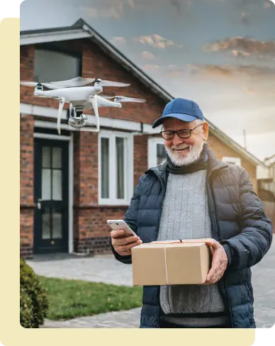
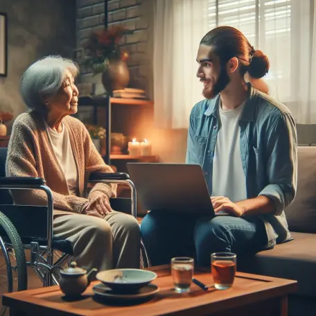
Individuals with disabilities and those in areas lacking nearby shops face challenges in accessing essential items independently. Additionally, people increasingly lack time for traditional shopping.
The goal:
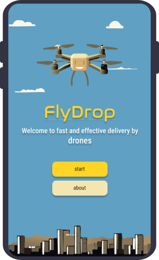
Design a specialized drone delivery app to empower individuals with disabilities, residents in underserved areas, and busy individuals. The app aims to provide fast and easy way to remote shopping, optimizing time and enhancing accessibility for users with diverse needs.
About
type
mobile app
category
on-demand shopping
project duration
09/2023 – 12/2023
my role
This is an individual project that allowed me to plan and direct each step of the design thinking process.
Research
To understand user frustration, needs, and requirements, I conducted user research through interviews. I have also conducted secondary research using statistical data and articles.
Statictics about drone delivery
Consumer Acceptance:
Roughly 79% of buyers over the internet would agree to get delivery by a drone.”
Consumer Acceptance:
Drone delivery is 90% of cheaper than car service delivery.
Time Optimizing:
Drones can fly up to 80 km/h while delivering goods.
Social Good:
Drone units can be employed in remote or inaccessible regions to successfully deliver vaccines, pharmaceuticals, and other medicines.
The interview was conducted with 5 people with different backgrounds, potentially interested in drone delivery.
“A good guide on how to use drone delivery is crucial.”
-Young massage therapist
“Standard shipping can sometimes take longer than expected, which delays my plans or business operations.”
-Busy programmist
“If I encounter any issues or have questions about the drone delivery service, I would like to know that there is accessible customer support available to assist me.”
-Retired woman
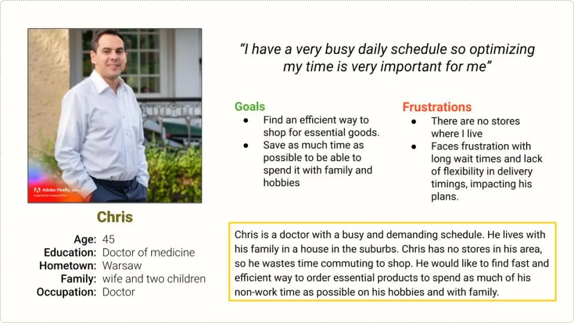
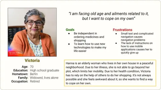
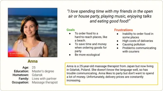
Personas
Key Painpoints
Based on research, I found out the most important problems user experience using on-demand delivery apps.
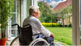
Limited Mobility for Individuals with Disabilities
Lorem ipsum dolor sit amet, consectetur adipiscing elit. Ut elit tellus, luctus nec ullamcorper mattis, pulvinar dapibus leo.
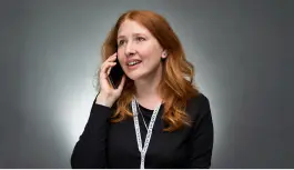
Time Constraints for Busy People
Busy professionals encounter difficulties in allocating time for traditional shopping methods, needing a more time-efficient solution for their daily needs.
Delivery to some locations is not possible
Residents in hard-to-reach locations lack convenient access to essential products and services, making it challenging to meet their daily needs efficiently.
Communication Barriers with Traditional Services
Users experience challenges in effective communication with coursiers who do not speak the national language, leading to misunderstandings
Ideation
To solve main pain points I came up with features that will make the app more useful and usable.
Accesibility
screen readers avaiable,
voice control
multi language
no-contact delivery
user-friendly interface and clear communication thgroughout the delivery process
Convenience & Efficiency
order tracking,
ordering in advance for specific time and location,
re-submitting previous orders,
faster delivery and greater range than traditional methods,
special funcionalities for shopping medical products.
Cost & affordability
discounts,
loyalty system,
smaller cost of delivery than competitors, thanks to the use of drones, which are a relatively cheap delivery option.
Support & Assistance
tutorial in app,
mini game to learn about drones,
AI avatar guiding user through app,
easy acces to contact customer service
Story boards
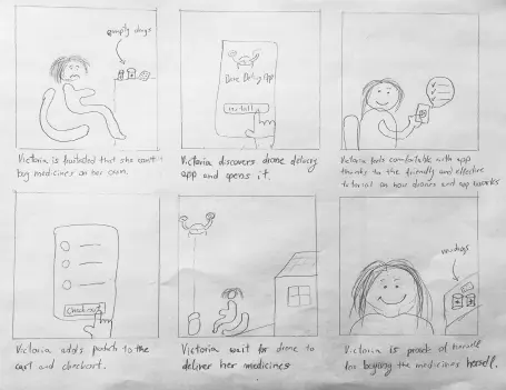
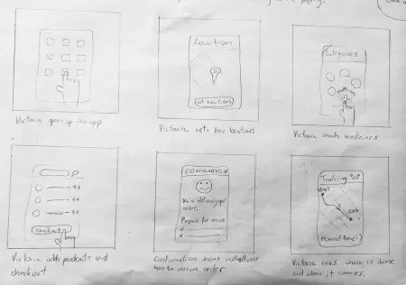
I’ve created storyboards to visualise how the app can be used.
big picture
close up
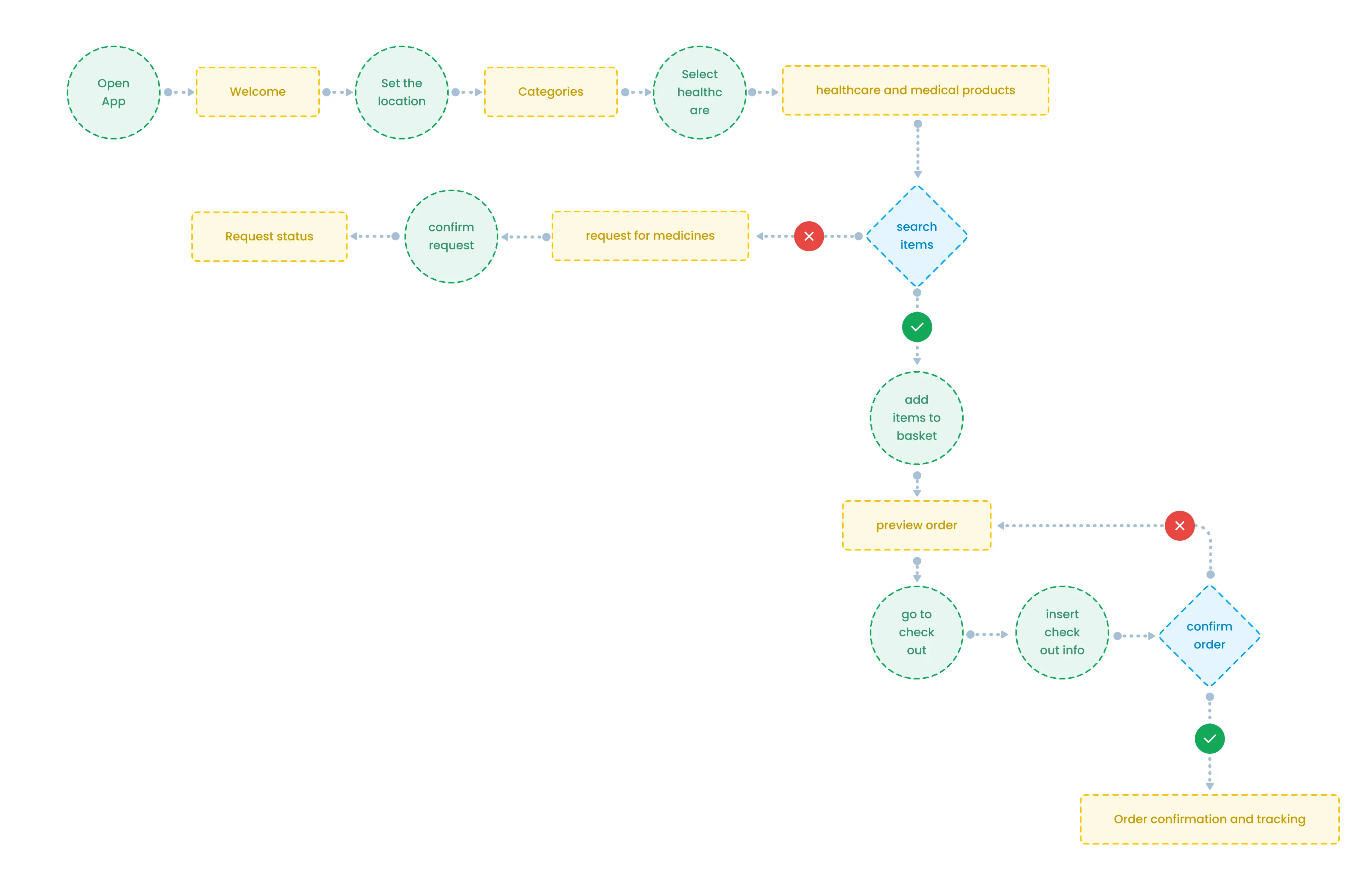
User flow
Take a closer look at the user flow within drone delivery app using this scenario: a seamless order for medicines delivered right to your doorstep. This user flow is just a snapshot of the app’s diverse capabilities.
Building the first prototype
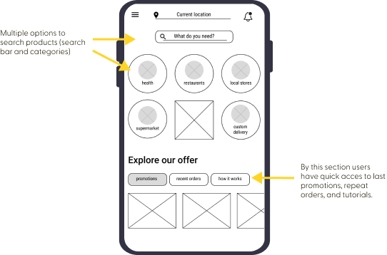
Simple home screen for easy and quick ordering
Busy users wants an easy way to quickly order what they need. A simple start screen with the most important information and quick access to previous orders makes it easier for them and also tech beginners benefit.
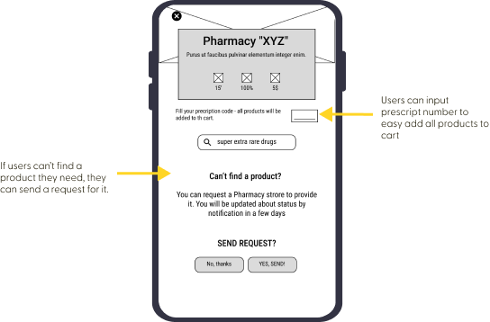
Ordering medicines
As drone delivery might help people with health problem I added some useful options for them.
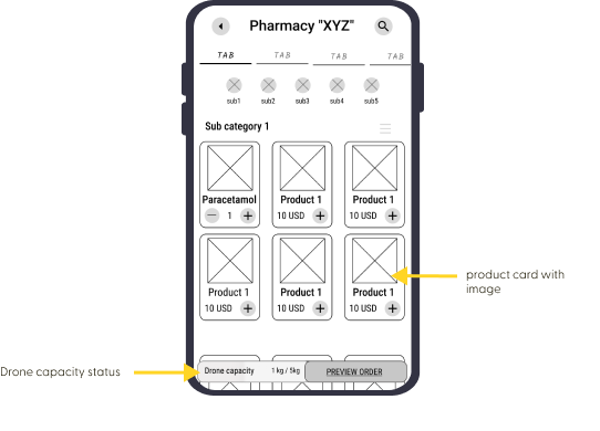
Drone’s capacity
Drones have limited capacity, so the app must show the user how much space is left.
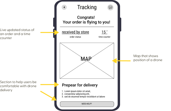
Supporting the user
Drone deliver is something new so I made sure to provide live-tracking screen with most important informations.
Usability study of the prototype
I conducted moderated usability study with 5 participants. They were asked to perform tasks in the low fidelity prototype.